

The evolution of the SaaS landing page
Vrijdag 17 juli 2015
De evolutie van de SaaS-bestemmingspagina
Als je kijkt naar de landingspagina's (of homepages of marketingsites, hoe je ze ook wilt noemen) van de SaaS-bedrijven van tegenwoordig, zien ze er meestal heel mooi uit. Ze hebben meestal een schone, eenvoudige en vriendelijke uitstraling, met heel weinig tekst en heel veel afbeeldingen of video's. In veel gevallen kunnen deze websites net zo goed reclame maken voor een consumentenproduct. Dit is geen verrassing, omdat de consumerizate van bedrijfssoftware de afgelopen jaren een van de belangrijkste drijvende krachten in de softwarewereld is geweest. Maar websites voor B2B-software hebben er niet altijd zo uitgezien en het is fascinerend om te zien hoeveel dingen zijn veranderd. Ga met me mee als ik terug in de tijd ga en bekijk hoe SaaS-bestemmingspagina's er enkele jaren geleden uitzagen. Het stenen tijdperk van SaaS
Fast-backward ongeveer 16 jaar. Zo zag de website van Salesforce.com - het meest innovatieve softwarebedrijf van die tijd - er in 1999 uit:
Interessant is dat, zo vreselijk als de site volgens de huidige normen uitziet, het een beetje een consument-achtig gevoel heeft en in de loop van de tijd eigenlijk meer enterprise-y werd (je kunt de geschiedenis doorbladeren op het internetarchief , dat ik gewend ben neem deze screenshots). Dus misschien was de wereld in 1999 en het begin van de jaren 2000 nog niet klaar voor consumerization, of ontdekte Salesforce.com niet de juiste aanpak of zagen ze meer succes met een top-down enterprise sales-aanpak.
The Beginnings of Modern (SaaS) Times
Not much happened on the SaaS design front in the following years. Until 2004, that is, when a small, Chicago-based web design agency called 37signals launched its project management tool called Basecamp:
Basecamp looked radically different from any other piece of B2B software. If it's possible to pinpoint the beginning of modern SaaS to a specific company or product, I think this honor is due to Jason Fried and his colleagues at 37signals. As much as I disagree with Jason on many things he writes about how to build a business – kudos to 37signals for their focus on product, design and usability. No other SaaS company had a bigger influence on SaaS design.
It took a few years – which shows how much ahead of its time 37signals was – but eventually other SaaS companies redesigned their websites or rebuilt them from the ground up:
The trend was clear: Less and less text, bigger font sizes, larger images, videos. SaaS companies which were founded at that time had a stronger focus on design from the get-go:
Contemporary SaaS Design
In the years that followed, the trend towards simplicity, focus on design and consumerization continued, and I'd say that since around 2012 or 2013, having a reasonably beautiful and conversion-optimized marketing website is more or less table stakes. Today you can buy a SaaS landing page template for $18. A $18 design which looks better than every B2B website that was built before 2004 – makes me wonder if Moore's law applies in design, too. ;-)
Since most people are trend-followers rather than trend-setters, SaaS landing pages started to look more and more alike in the last few years: A navigation bar at the top; 1-2 devices that were made in Cupertino, with product screenshots on them; a large headline and smaller sub-headline; 1-2 call-to-action buttons; some customer logos. This (plus a few other things) was the anatomy of almost every SaaS landing page in 2014. Not bad, don't get me wrong, but if everyone follows that recipe it gets harder and harder to stand out and build something memorable.
But just when things started to get boring, some cutting-edge design-led SaaS companies pushed the envelope further:
Both examples make heavy use of video so the screenshots don't do them justice. Please go to Geckoboard and Typeform to see them in action. While still being focused on conversion, I think these websites are almost indistinguishable from art. Using high-quality video footage, very little text and beautiful typography, crafted with incredible attention to detail, these websites bring across a value proposition in a fresh, unique and highly emotional way.
This little journey through time has shown that up until now, the evolution of the SaaS landing page has been a development towards ever more simplicity. It will be interesting to see if this trend continues in the coming years.
Disclosure: I'm an investor in Clio, Zendesk, Geckoboard and Typeform.
Fast-backward ongeveer 16 jaar. Zo zag de website van Salesforce.com - het meest innovatieve softwarebedrijf van die tijd - er in 1999 uit:
 |
| Salesforce.com in 1999 (klik voor een grotere versie) |
Interessant is dat, zo vreselijk als de site volgens de huidige normen uitziet, het een beetje een consument-achtig gevoel heeft en in de loop van de tijd eigenlijk meer enterprise-y werd (je kunt de geschiedenis doorbladeren op het internetarchief , dat ik gewend ben neem deze screenshots). Dus misschien was de wereld in 1999 en het begin van de jaren 2000 nog niet klaar voor consumerization, of ontdekte Salesforce.com niet de juiste aanpak of zagen ze meer succes met een top-down enterprise sales-aanpak.
The Beginnings of Modern (SaaS) Times
Not much happened on the SaaS design front in the following years. Until 2004, that is, when a small, Chicago-based web design agency called 37signals launched its project management tool called Basecamp:
 |
| Basecamp in 2004 (click for a larger version) |
Basecamp looked radically different from any other piece of B2B software. If it's possible to pinpoint the beginning of modern SaaS to a specific company or product, I think this honor is due to Jason Fried and his colleagues at 37signals. As much as I disagree with Jason on many things he writes about how to build a business – kudos to 37signals for their focus on product, design and usability. No other SaaS company had a bigger influence on SaaS design.
It took a few years – which shows how much ahead of its time 37signals was – but eventually other SaaS companies redesigned their websites or rebuilt them from the ground up:
 |
| Campaign Monitor in 2008 (click for a larger version) |
The trend was clear: Less and less text, bigger font sizes, larger images, videos. SaaS companies which were founded at that time had a stronger focus on design from the get-go:
 |
| Clio in early 2009 (click for a larger version) |
 |
| Zendesk in 2010 (click for a larger version) |
Contemporary SaaS Design
In the years that followed, the trend towards simplicity, focus on design and consumerization continued, and I'd say that since around 2012 or 2013, having a reasonably beautiful and conversion-optimized marketing website is more or less table stakes. Today you can buy a SaaS landing page template for $18. A $18 design which looks better than every B2B website that was built before 2004 – makes me wonder if Moore's law applies in design, too. ;-)
Since most people are trend-followers rather than trend-setters, SaaS landing pages started to look more and more alike in the last few years: A navigation bar at the top; 1-2 devices that were made in Cupertino, with product screenshots on them; a large headline and smaller sub-headline; 1-2 call-to-action buttons; some customer logos. This (plus a few other things) was the anatomy of almost every SaaS landing page in 2014. Not bad, don't get me wrong, but if everyone follows that recipe it gets harder and harder to stand out and build something memorable.
But just when things started to get boring, some cutting-edge design-led SaaS companies pushed the envelope further:
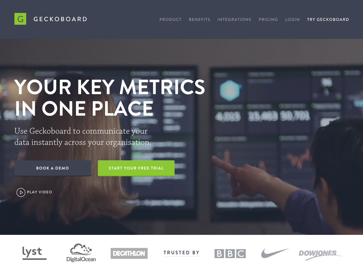 |
| Geckoboard's current website Go to www.geckoboard.com to see it live |
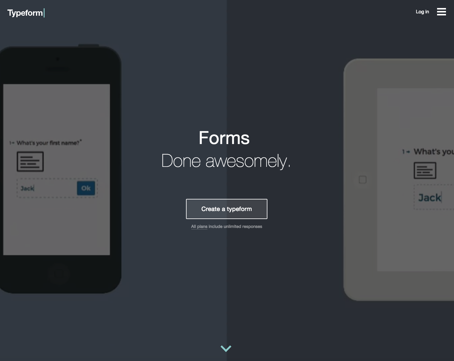 |
| Typeform's current website Go to www.typeform.com to see it live |
 |
| Another view of Typeform's current website Go to www.typeform.com to see it live |
Both examples make heavy use of video so the screenshots don't do them justice. Please go to Geckoboard and Typeform to see them in action. While still being focused on conversion, I think these websites are almost indistinguishable from art. Using high-quality video footage, very little text and beautiful typography, crafted with incredible attention to detail, these websites bring across a value proposition in a fresh, unique and highly emotional way.
This little journey through time has shown that up until now, the evolution of the SaaS landing page has been a development towards ever more simplicity. It will be interesting to see if this trend continues in the coming years.
Disclosure: I'm an investor in Clio, Zendesk, Geckoboard and Typeform.
Labels:
design ,
saas ,
software als een service
Abonneren op:
Reacties plaatsen (Atom)
Over Christoph Janz

Ik ben een partner op Point Nine Capital . Eerder was ik een internetondernemer en engelinvesteerder. In 1997 ben ik mede-oprichter van DealPilot.com (overgenomen door Shopping.com ) en in 2005 ben ik mede-oprichter van Pageflakes (overgenomen door LiveUniverse). Mijn investeringen omvatten Zendesk , FreeAgent , Geckoboard , Algolia , Typeform , Contentful en andere SaaS-startups.
Volg me op Twitter
Ontvang nieuwe berichten in je inbox
Vul je e-mailadres in:
populaire posts
- Een KPI-dashboard voor beginnende SaaS-startups
- Vijf manieren om een bedrijf van $ 100 miljoen te bouwen
- Weet u niet zeker hoeveel u zelf moet betalen? Bekijk deze oprichter salariscalculator.
- Financiële planning voor SaaS-startups
- SaaS Financieel Plan 2.0
- Een KPI-dashboard voor beginnende SaaS-startups - nieuw en verbeterd!
- Cohortanalyse: een (praktische) vraag en antwoord [Gastbericht]
- Wat is er nodig om in SaaS in 2016 kapitaal aan te trekken?
- Goede VC's, slechte VC's
- De evolutie van de SaaS-bestemmingspagina
Labels
angel investing
(9)
cibando
(2)
clio
(2)
customer bill of rights
(1)
financial plan
(9)
fortune 5000000
(1)
freeagent central
(2)
geckoboard
(2)
grandfathering
(1)
infakt.pl
(1)
investment
(5)
metrics
(12)
momox
(1)
mygengo
(1)
pageflakes
(15)
point nine
(16)
productivity
(5)
propertybase
(1)
saas
(74)
samedi
(1)
shiftplanning
(1)
startups
(22)
vc (20) risicokapitaal (25) westwing (1) zendesk (10)
Source: christophjanz.blogspot.com
